Good Sense
•••
Making life nuttier since 1976
Reward yourself in a healthy way
Good Sense Foods has been bringing you happiness by the handful for two generations. Inspired by fun family adventures and born in their kitchen in Minnesota, they take pride in bringing you the best in healthy & delicious snacks. They roast, blend and package their snacks in-house to ensure you are getting the highest quality products with ingredients that are responsibly sourced, nutritious and always delicious.
With over 40+ years of quality, consistency and innovation to the Produce section it was time for a makeover. As they enter an omnichannel world, the importance of brand continuity in all their retail channels and their emerging digital channel is clear. Good Sense needed to continue to foster and improve brand connectivity. The brand needed to better differentiate itself from competition and bring those differences to the consumer’s attention. It was essential to continue to challenge what healthy snacking means and introduce new product offerings that surprise and delight consumers.
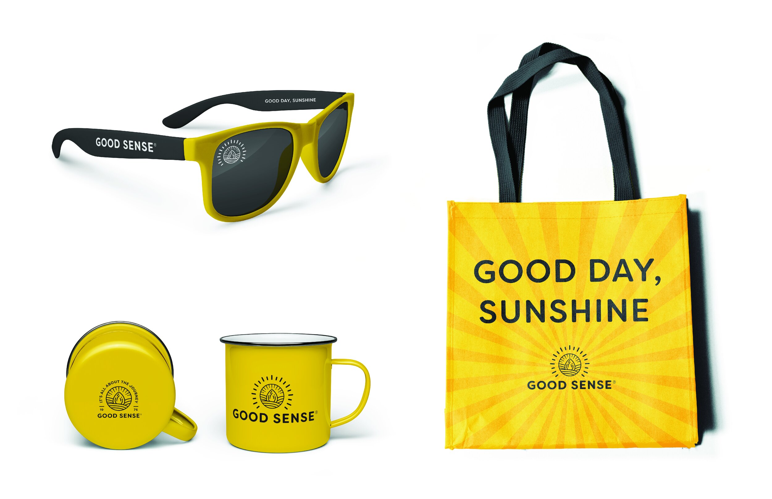
Bright’s goal was to take their legacy and make a modernized and bold impact on the shelf for years to come. Utilizing a strong typography & color system we resolved brand extension inconsistencies. The Good Sense symbol/logotype/texture has been modernized to be more relatable to a broader set of consumers and more legible online. It represents the brand’s commitment to quality, land and environment. We expanded this new system across all 53 products, spanning 5 categories: Seeds & Nuts, Dried Fruit, Snack Mixes, Trail Mixes, Savory Snacks.
Project Scope
•••
Brand Vision | Consumer Research | Identity Refresh | Naming | Packaging | Brand Extension | Brand Guidelines | Brand Story | Digital Campaign | Social Campaign