safeway
•••
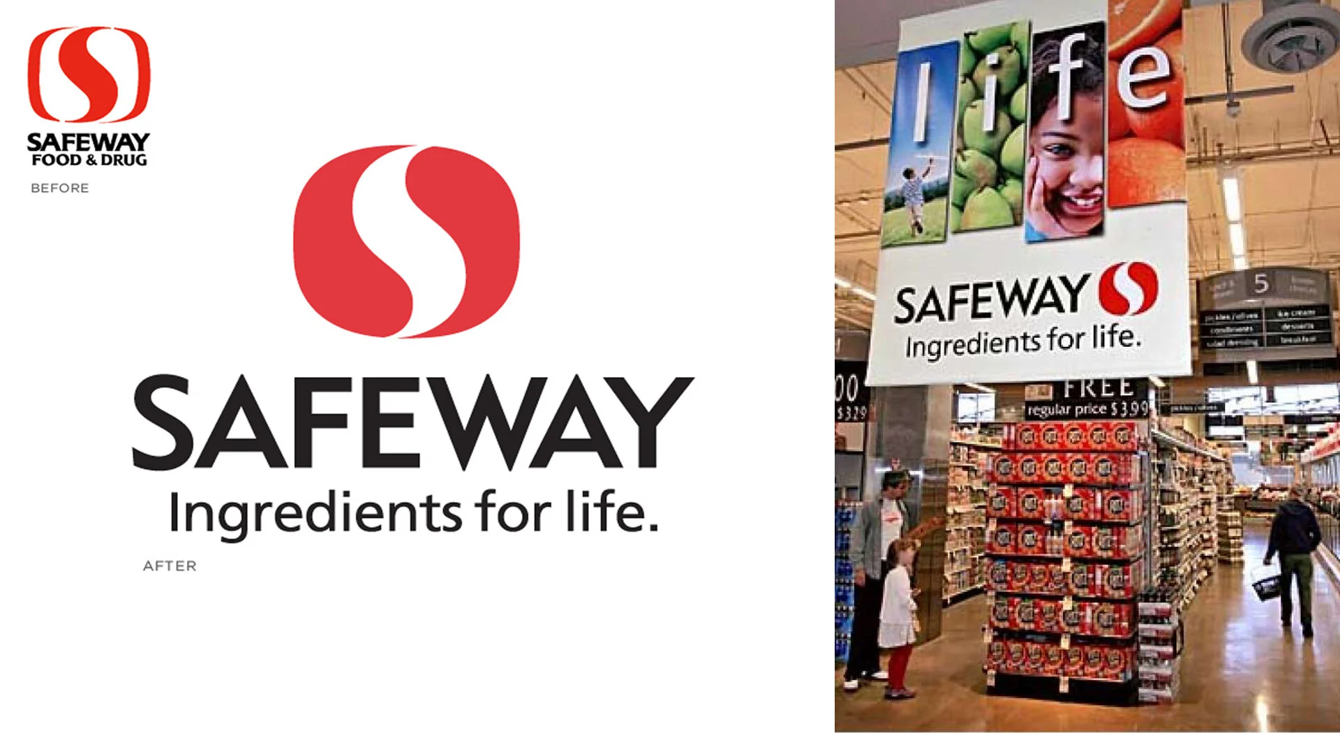
To meet competitive demands and shifts in shopper needs, and as one of North America’s largest food and drug retailers, Safeway embarked on a brand repositioning to include a new identity and the tagline “Ingredients for life”.
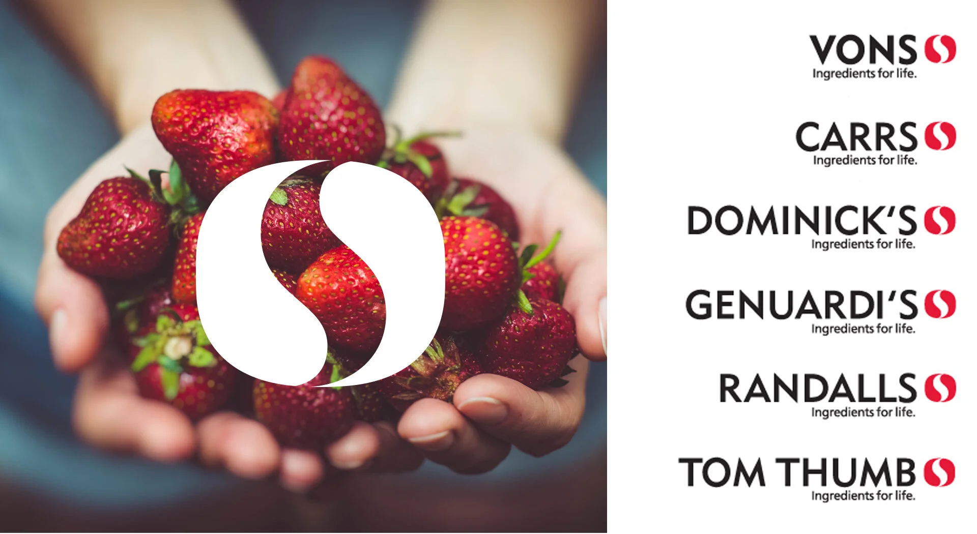
Acknowledging the equity of red, we retained the color and inched our way out to an identity that resonates with customers’ confidence and trust in the brand at the same time as providing a fresh and contemporary solution that is crisp, simple and strong. We provided usage guidelines across multiple touch points that were executed in nearly 1,800 stores on signage, merchandising, promotions/advertising and consumer branded products.
Project Scope
•••
Identity Refresh | Brand Extension | Brand Guidelines